
Logo with the word Banter in bold, purple script font above the words DESIGN CO. in uppercase light purple block letters on a white background, creating a fresh and memorable look that reflects a strong sense of brand identity and effective branding strategy.
White logo with an abstract symbol next to the letters WPHCA and the tagline Serving Wisconsin Community Health Centers below, all on a light gray background—reflecting a strong sense of branding and strategy throughout its clean, professional design.

Wisconsin Primary
Healthcare Association 

Rebranding | Brand Guidelines | Web Design & Development

Marketing Materials | Subrand Developement

Wisconsin Primary Health Care Association (WPHCA) was in need of a brand refresh that showcased the upbeat, energetic yet professional reputation they had established. We gave them a new current look with an extensive color palette that allows them to play, while still feeling consistently branded.
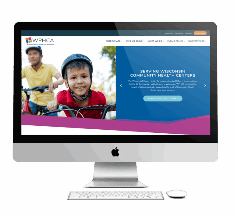
A desktop computer displays the WPHCA website, featuring a smiling boy and an adult riding bicycles, with text about serving Wisconsin community health centers and promoting strong community branding. A keyboard and mouse are on the white desk.
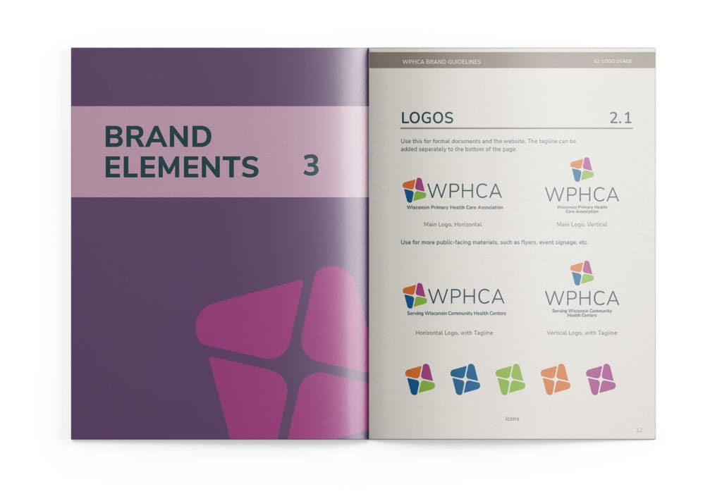
An open brand guideline booklet displays essential Brand Elements 3 on the left page and a variety of logo variations for WPHCA, complete with colorful icons and text details, on the right page—offering valuable branding insights for effective marketing strategies.
WPHCA logo featuring four colorful shapes forming a pinwheel above the text WPHCA Wisconsin Primary Health Care Association on a light background, showcasing effective branding as part of their overall marketing strategy.
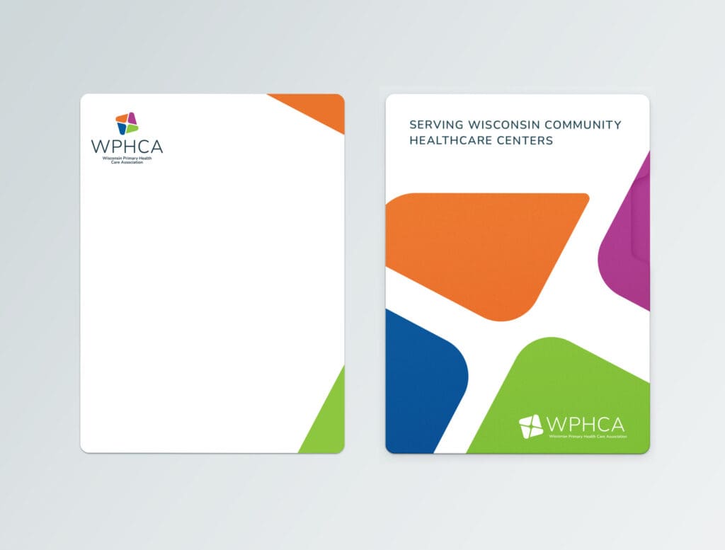
Two notepad designs feature the WPHCA logo, exemplifying the organization’s brand strategy. One has a mostly white background with colored accents, while the other uses bold, colorful shapes alongside the text Serving Wisconsin Community Healthcare Centers—making both notepads ideal for marketing and outreach initiatives.
Green abstract icon followed by large white letters MAA and smaller text below reading Medical Assistant Apprenticeship on a light gray background, creating a distinctive brand identity that aligns with effective marketing strategy.
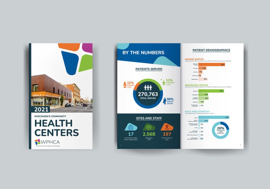
WPHCA Health Centers brochure
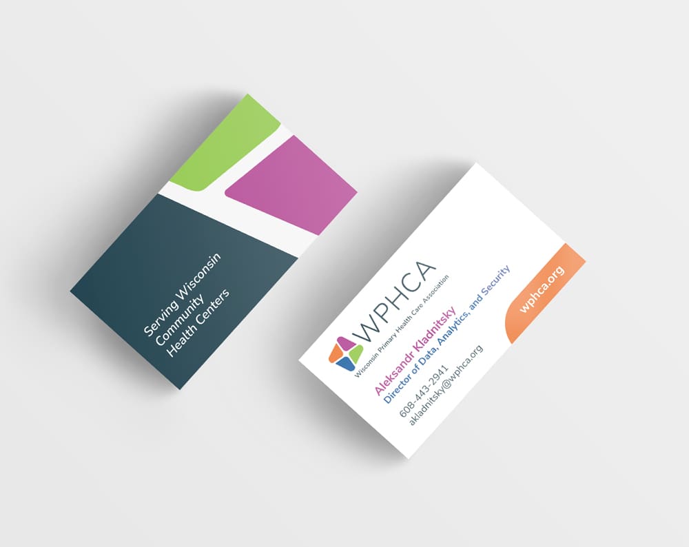
Two business cards featuring a colorful geometric design highlight the marketing strategy behind a strong brand presence. One card displays "Serving Wisconsin Community Health Centers," while the other provides contact info for Alexander Kozakiewicz of WPHCA and the website wphca.org.
Icons representing general use, workforce, partnership, quality, strategy, and public policy—each with unique colors and simple line art symbols related to their category—arranged in rows on a white background to enhance brand clarity.

Fabulous, right?

Let's Banter about it. Schedule a quick Clarity Call today. We'll talk about you, we'll talk about us, we'll talk about baked goods. It will be fun!

See More of Our Work

Violins of Hope – Wisconsin | MYSO

Disability Rights Wisconsin

She Stands Tall

Oasis

Kelly’s Greens

Webers

Milwaukee Parks Foundation

InContext

Danforth

Verdasure

MARN

Stamm