Logo with the word Banter in bold, purple script font above the words DESIGN CO. in uppercase light purple block letters on a white background, creating a fresh and memorable look that reflects a strong sense of brand identity and effective branding strategy.
Logo with the word Webers in large, stylized green script above the word GREENHOUSE in smaller, uppercase green letters. The design has a modern, fresh, and nature-inspired look, making it an ideal choice for branding and marketing a vibrant, eco-friendly brand.

Webers Greenhouse

Brand Design and Brand Strategy


Webers Greenhouse is a cherished neighborhood plant store located at 4215 North Green Bay Avenue. This beautiful greenhouse was founded back in 1931 by Frank Weber, originally selling just flowers. The greenhouse has now grown to have a deeper mission, covers almost an acre of land, and sells tons of varieties of veggies, flowers, and more.

Our design process was inspired by a vintage red neon sign that stands on the building today. Drawing inspiration from its charm, we enhanced the hand-drawn letters to ensure legibility while preserving the whimsical features. Additionally, we incorporated a two-tone shadow to the primary logo, mirroring the depth of the neon sign. To support the primary logo, we crafted a new sub mark icon and a “Powered by Teens Grow Teens” badge.

A person holds a large tote bag featuring colorful vegetable illustrations and “Webers” branding printed on it. Pink flowers stick out of the bag, while green leafy plants provide a lush backdrop—showcasing the brand’s fresh and vibrant strategy.
The vibrant color palette complements the Teens Go Greens brand, the parent organization of Webers Greenhouse. Teens Go Greens is dedicated to empowering teenagers through transformative experiences, skill development, and connections to leadership opportunities. Webers Greenhouse proudly employs six apprentices each summer, all graduates of the Teens Grow Greens program.
White text on a dark green background reads: POWERED BY TEENS GROW GREENS—a statement reflecting bold branding and thoughtful strategy. The text is centered within a white-bordered box.
A green stylized W with leaf-like ends is centered inside a partial circle, symbolizing fresh branding and growth, with the word GREENHOUSE—suggestive of an innovative marketing strategy—curved along the right side.
Illustration of six vegetables and one fruit lined up: broccoli, cantaloupe slice, watermelon, tomato, pumpkin, eggplant, and a cross-section of a green vegetable or fruit—perfect for branding or marketing materials seeking vibrant, healthy imagery.
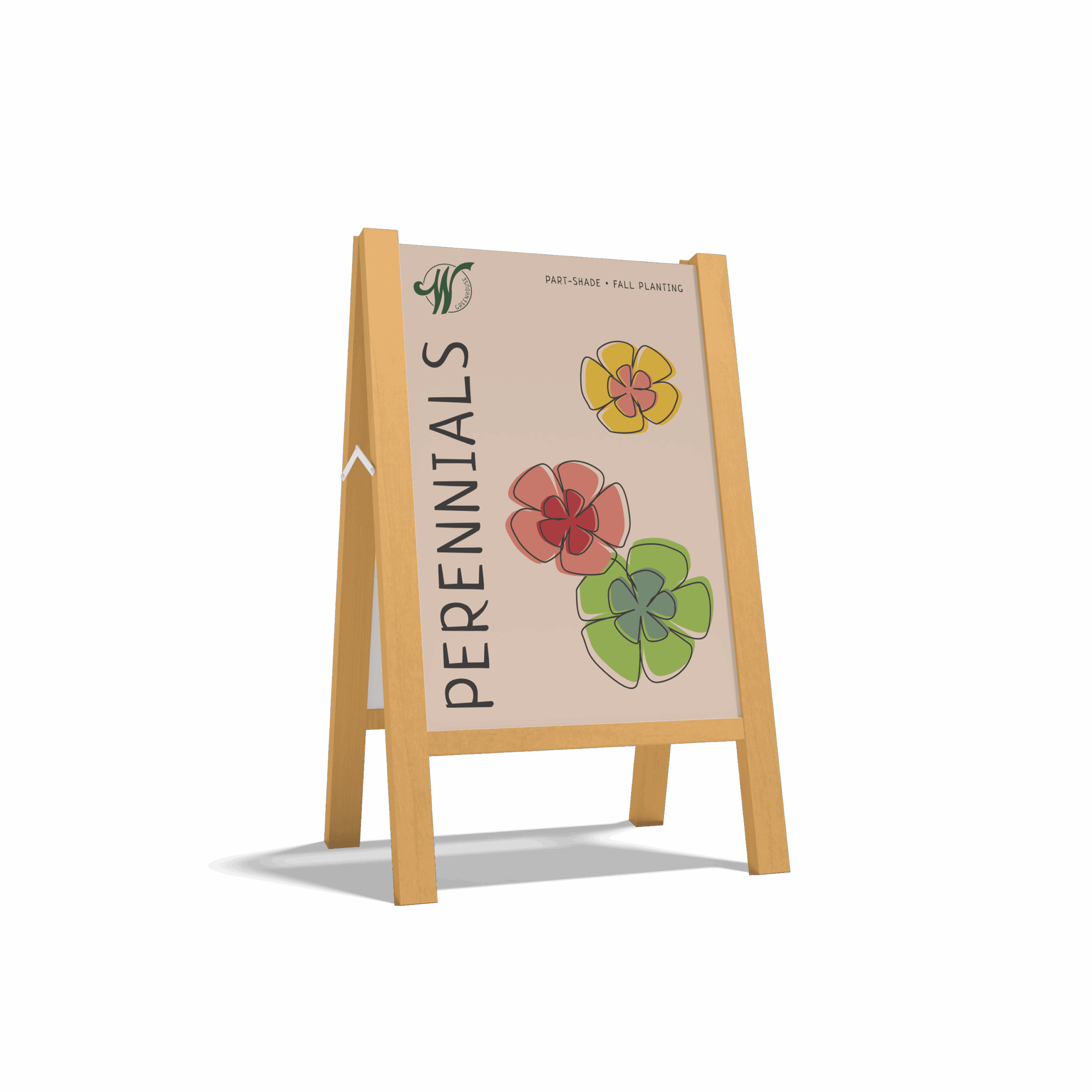
A wooden A-frame sign displays colorful flower illustrations and the word PERENNIALS vertically, along with small text reading PART-SHADE • FALL PLANTING on a beige background, offering an inviting touch that enhances your overall branding strategy.
Odvant redesigned our logo and we couldn’t be happier.
Their team took great care in telling our story perfectly in their designs, and the process was really fun!

Claire Muza, Growing Director, Webers Greenhouse

Fabulous, right?

Let's Banter about it. Schedule a quick Clarity Call today. We'll talk about you, we'll talk about us, we'll talk about baked goods. It will be fun!

See More of Our Work

Violins of Hope – Wisconsin | MYSO

Disability Rights Wisconsin

She Stands Tall

Oasis

Kelly’s Greens

Milwaukee Parks Foundation

InContext

Danforth

Verdasure

MARN

Stamm

ActsHousing