Logo with the word Banter in bold, purple script font above the words DESIGN CO. in uppercase light purple block letters on a white background, creating a fresh and memorable look that reflects a strong sense of brand identity and effective branding strategy.
Large white letters spell VIA above the slogan Connecting People Strengthening Places on a light gray background, presenting a clean and modern branding strategy.

Rebranding LBWN

Rebranding | Marketing Materials
Brand Guidelines | Web Design and Development

Layton Boulevard West Neighbors (LBWN) wanted a new name and branded look, which needed to be memorable, professional, flexible and approachable. We worked with Sanmitra Iwanski to find a name while we did the logo, icons, marketing materials and website.

Blue text says Strategy Connecting People Strengthening Places around yellow line drawings of a building, a tree, and a house, emphasizing the brand’s commitment to community-focused branding.
It was great working with Dena and Nydia, who are insightful, grounded, enthusiastic, and visionary. They not only helped us communicate who we are more effectively, but helped us understand our organization better in the process. Always one step ahead, they really did go above and beyond. It was evident that they really cared about our organization and our community, and in working with them I know we’ll be able to be even more impactful in the years to come.

This was a huge undertaking that took a turn from the start when we all shifted to this remote-work-life. They listened, were open to our decision-making processes, and acted as our partners. They made it possible to take this step beautifully & gracefully.
Brianna Sas-Pérez
Former Executive Director, VIA CDC
Two overlapping website windows, one with a yellow and red VIA rebrand announcement, icons, and text highlighting the company’s refreshed brand strategy, the other showing a neighborhood scene and “Layton Park” information on a clean, white background.
Collage of website screenshots showing various pages, including “Guiding Documents,” “Amenities,” and “Partner With Us” sections, all under the VIA organization branding, displayed on desktop and mobile browsers—highlighting a cohesive brand strategy that reinforces VIA’s marketing presence across platforms.
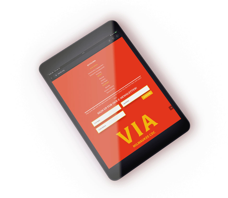
A black tablet displays a red website page with a newsletter sign-up form, showcasing large yellow text reading VIA at the bottom—a vibrant example of eye-catching branding and effective marketing strategy.
A sheet of white paper with a VIA logo at the top center and a row of yellow cartoon faces and small red text along the bottom edge, shown on a light gray background—perfect for showcasing your branding or elevating your marketing strategy.
VIA brand guidelines

Brand Activation | Launch Video

Fabulous, right?

Let's Banter about it. Schedule a quick Clarity Call today. We'll talk about you, we'll talk about us, we'll talk about baked goods. It will be fun!

See More of Our Work

Violins of Hope – Wisconsin | MYSO

Disability Rights Wisconsin

She Stands Tall

Oasis

Kelly’s Greens

Webers

Milwaukee Parks Foundation

InContext

Danforth

Verdasure

MARN

Stamm