
Logo with the word Banter in bold, purple script font above the words DESIGN CO. in uppercase light purple block letters on a white background, creating a fresh and memorable look that reflects a strong sense of brand identity and effective branding strategy.
Large, light gray capital letters spell STRU X TION on a white background, with a bold, stylized green and blue X in the center—creating a striking visual ideal for impactful branding or marketing materials.

Struxtion

Brand Strategy | Web Design | Style Guide | Marketing Materials

Struxtion is a financial services platform for general contractors, owners, developers, andspecialty contractors. They had a logo, but not a refined brand voice or visual language. Westreamlined their assets and messaging for their multiple target markets.
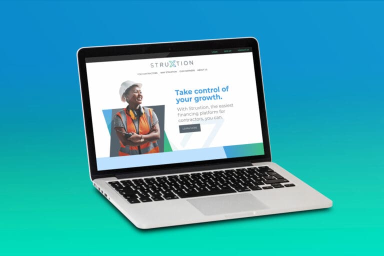
A laptop displays a website for Struxtion, a financing platform for contractors. The screen shows a smiling person in safety gear and the headline “Take control of your growth,” highlighting Struxtion’s brand strategy to empower professionals through smart financial solutions.
A flyer for Struxtion, designed with a strong branding strategy, describes how slow payments impact construction businesses, highlights statistics and program benefits, and shows professionals in safety gear talking on a construction site.
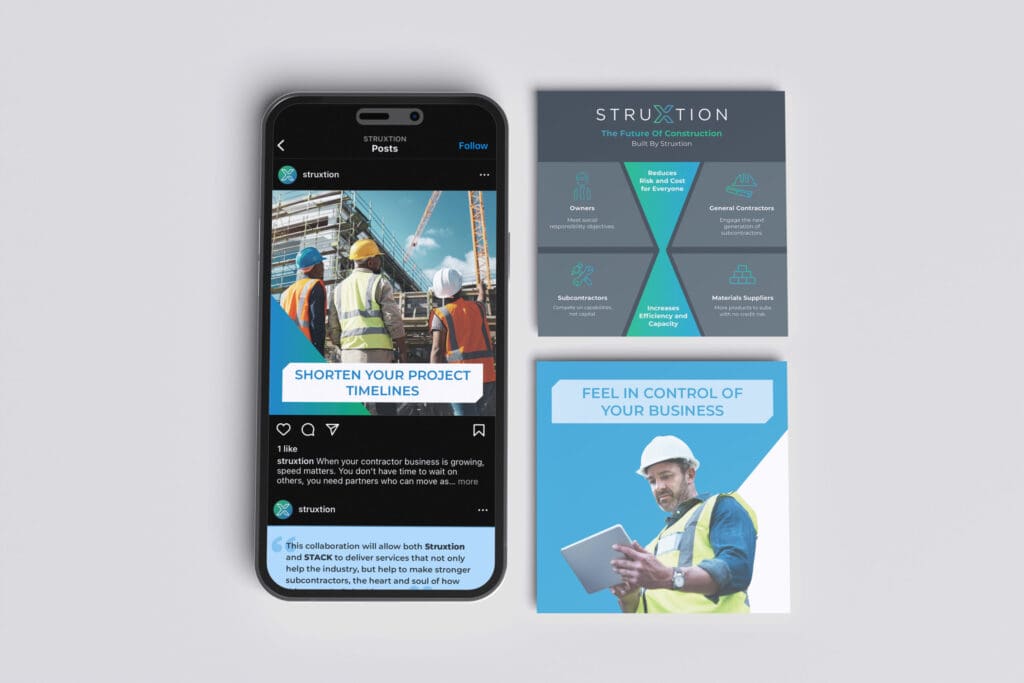
Three marketing images for Struxtion featuring construction workers, a smartphone with a social media post, and promotional materials highlighting project timelines and business control. Blue accents and safety gear are visible, showcasing the brand’s commitment to smart strategy and impactful marketing in the construction industry.
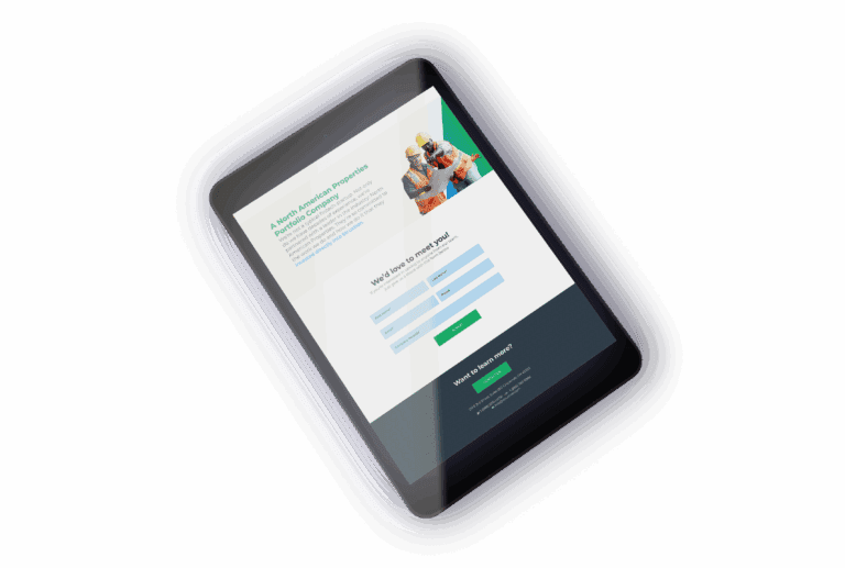
A tablet displays an online form with fields to enter name, email, and phone number. At the top, there's a photo of construction workers that reinforces the brand’s commitment to quality, while a green button at the bottom invites users to engage with your marketing strategy.
A mockup showing overlapping browser windows with a construction finance company's website. The top window features a construction worker in a hard hat and safety vest, reflecting the company's strong branding strategy, while the background displays text and a green “Learn More” button.
Four icons represent core elements of brand strategy and marketing: a wrench and hammer crossed, a hard hat with blueprints, a calendar, and a handshake, each in gradient blue and green outline style on a white background.
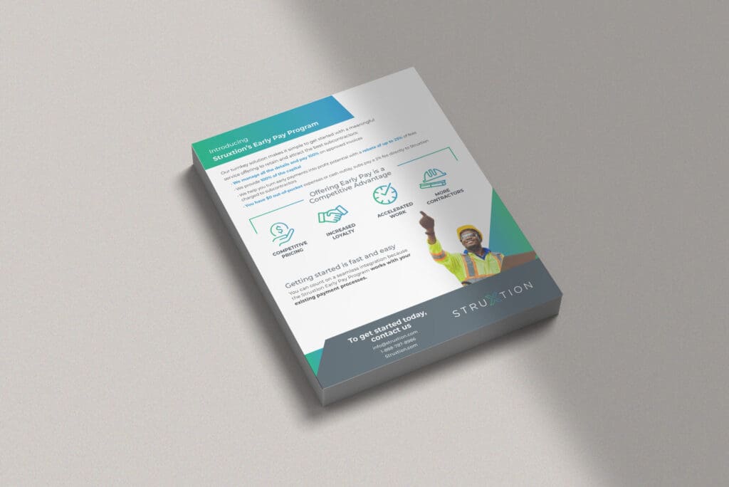
A flyer on a light surface promotes the StructionSite Early Pay Program, highlighting strong branding with icons for speed, paperless processing, and automation. A construction worker points upward, while the StructionSite logo at the bottom reinforces brand recognition.

Fabulous, right?

Let's Banter about it. Schedule a quick Clarity Call today. We'll talk about you, we'll talk about us, we'll talk about baked goods. It will be fun!

See More of Our Work

Violins of Hope – Wisconsin | MYSO

Disability Rights Wisconsin

She Stands Tall

Oasis

Kelly’s Greens

Webers

Milwaukee Parks Foundation

InContext

Danforth

Verdasure

MARN

Stamm