
From Creepy to Creative
Ever seen a rebrand so bad it your dreams? 💀 Or have you seen some that are frighteningly good?
Once in a while, a brand starts off with a cringe-worthy look or a messy identity that makes you want to run the other way. But in the world of branding, a scary start doesn’t have to be the end of the story. With the right tweaks, even the most terrifying brand fails can turn into a success.
The Challenge: Building a Connected Brand Universe
- Oversimplification, loss of character
- Poor readability or font choices
- Inappropriate or confusing symbolism
- Overly complex designs
- Lack of versatility for different platforms
Here are five brand makeovers that went from freaky to fantastic.
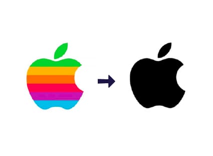
1. Apple: Steve knew what he was doing
Back in the late ’70s, Apple’s original logo was…a bit much. It was historical, but not exactly cutting-edge. Enter the now-iconic apple logo. Simple, sleek, and timeless. This shift transformed Apple from tech confusion to tech cool, making it the powerhouse brand we all know today.Lesson: Sometimes, less is more. A clean, simple design can speak volumes.
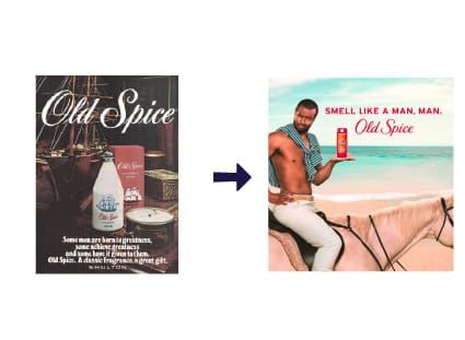
2. Old Spice: From Grandpa’s Cologne to the King of Cool
Old Spice had a serious image problem. For years, it was the “grandpa” of men’s grooming products. Then came that rebrand—the shirtless man on a horse, wild humor, and a complete shift in tone. Suddenly, Old Spice was the go-to brand for a younger audience. They embraced their old-school roots but gave it a modern twist, making them relevant and fresh again.Lesson: Don’t be afraid to lean into humor and personality. Bold moves can give an old brand new life.

3. Burberry: From Trench Coat Tragedy to Iconic Luxury
In the early 2000s, Burberry was known more for knockoffs and a dated image than high-end fashion. It was teetering on the edge of becoming irrelevant. Then they tightened up their brand with a strategic makeover—refining their product lines, revamping their logo, and embracing digital marketing. Today, Burberry is synonymous with luxury and innovation.Lesson: Refocusing on your brand’s core strengths can reinvigorate even the most faded image.
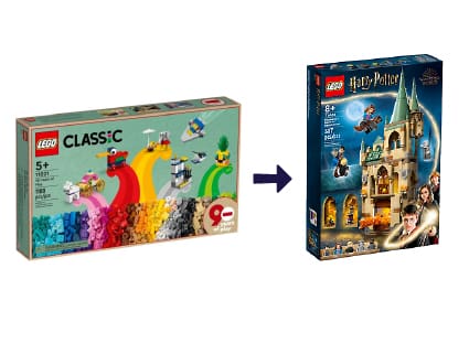
4. Lego: Building a Better Future
In the late ’90s, Lego hit a rough patch—sales were down, and the brand was losing its way. But rather than crumbling, they went back to the drawing board. By diversifying their products and launching collaborations with popular franchises aka, Star Wars and Harry Potter, Lego rebuilt itself into a global powerhouse.
Lesson: Evolve with the times but stay true to what your brand stands for. Smart partnerships can fuel success.
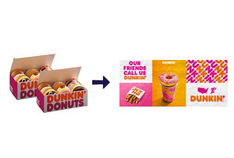
5. Dunkin: Admitting Failure and Rising from the Ashes
In 2018, they dropped “Donuts” from their name as part of a brand refresh allowing Dunkin’ to emphasize that they are more than just donuts—they also focus on beverages like coffee, which had become a huge part of their business. By simplifying their name and updating their branding to be more modern and flexible, Dunkin’ was able to broaden its appeal, particularly among younger audiences.
Lesson: Aligning a rebrand with customer habits is a long-term growth strategy.
What We Can Learn
A scary start doesn’t mean your brand is doomed. The trick is to recognize when it’s time for a change and to embrace it wholeheartedly. Whether it’s a complete overhaul or just a fresh set of eyes, the right approach can turn even the creepiest beginnings into a creative triumph.
3 Quick Steps on How to Avoid a Trip to the Rebrand Graveyard
- Test your designs with real people before launching.
- Stay true to your core values and brand identity.
- Keep it simple and versatile—logos need to work on everything from business cards to billboards.